
Click the link for the Full PDF: John.Dumrique-AnnualReport

Click the link for the Full PDF: John.Dumrique-AnnualReport

Click the link for the Full PDF: John.Dumrique.AirCanadaBrandGuidelines
For quite some time now, I’ve been wanting to redesign a company identity that is based in Canada. Having to grow up in the Philippines my whole life, I was intrigued on what I can design based on the elements and character that a new and very different country would provide me. I got the opportunity in this school project in which we were chosen to redesign the logo, website and stationary for a Canadian-based company and as soon as I saw that Air Canada was one of the options, I knew that I wanted that. I mean, what would be a bigger representation of Canada to the world than their own airline company.
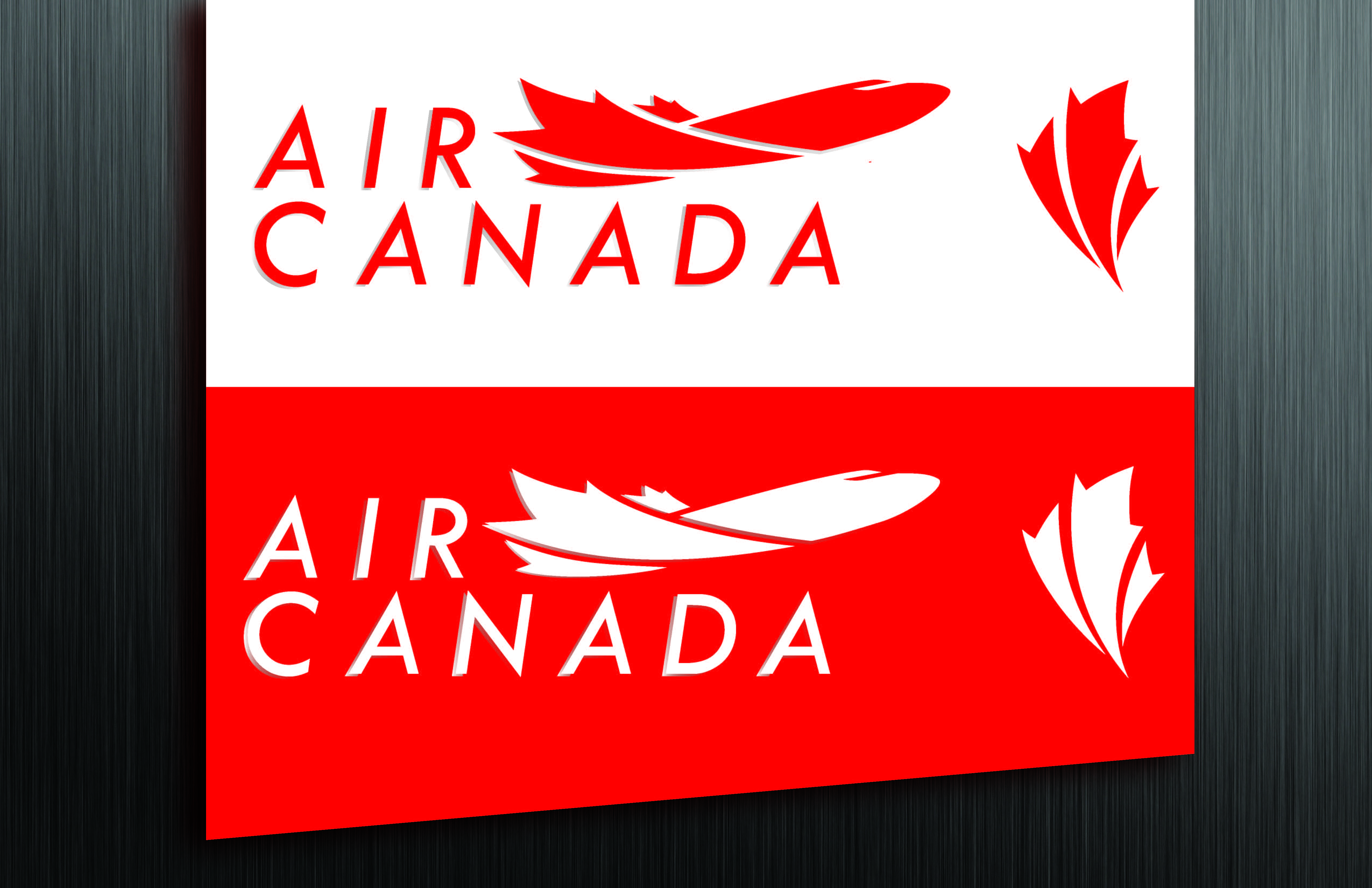
LOGO
After researching what they are about and studying how they came up with their current designs, I started by redesigning the logo. I figured that Canada and Air Canada airlines are most recognized by the maple leaf, therefore, I wanted that to be my core element. Since they are an airline company, I wanted to incorporate the silhouette of an airplane and the maple leaf so I started to create some sketches. After a lot of refining and fine tuning, I came up with a nice shape and added a modern font for the text Air Canada. The placing was tricky too as I wanted to know what the best place would be for the text. While doing some sketches, I also thought about doing a secondary logo as my first one would fit that well on the tail of a plane or something so I decided to make one and it turned out nice enough to be included in my final product.
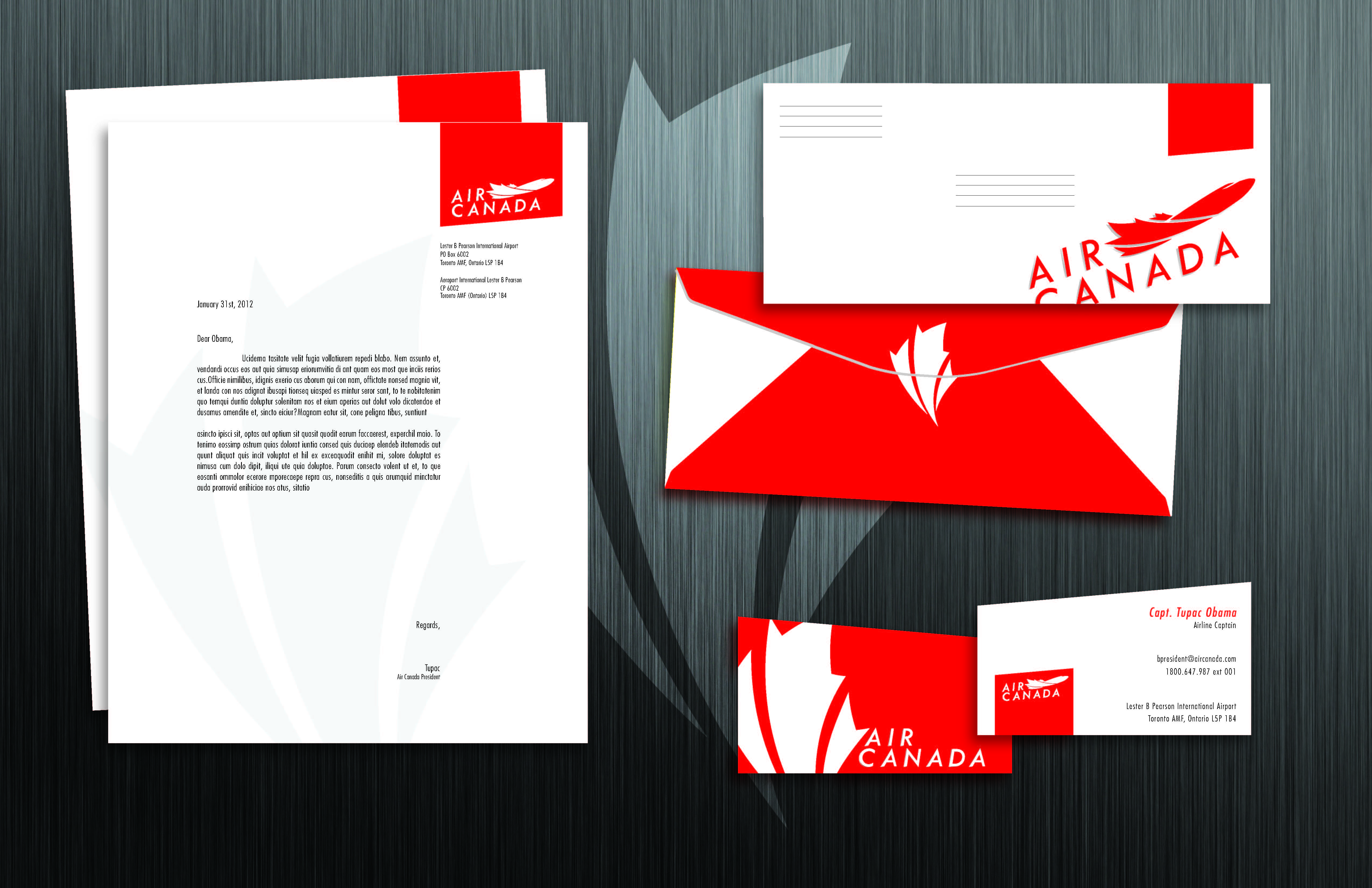
STATIONARY
The first thing I did for the stationary was the business card. I immediately thought of the shape not being a regular rectangular one but of the shape of a wing of an airplane. I gave an angle to one side and I had to be careful not to make it look like it was a cutting mistake and cut it too much either. (As commented by my teacher Todd Barsanti). After some careful thinking I came up with the placing and the grid where the elements such as the names and telephone numbers etc.. would be placed. I also thought that it would be nice to put the secondary logo at the back where it can be a representation of the company and people would incorporate it with Air Canada.
For the letterhead, I wanted it to be very sleek and sexy so I created a grid system in which the body and header would create columns. I also used the shape of the plane’s wing from the business card and made it into sort-of like a tab in which I put the logo and put it on an angle. My inspiration were the vintage classic designs they used for shapes and logos.
For the letter envelope, I still incorporated that “Wing Tab” and I put it on the upper right corner so that it would be the place to stamp the postal stamps. I just played around with the colors of the envelope panels and topped it all of with a sticker of the secondary logo that would seal of the mouth of the envelope.
WEBSITE
For the website on the other hand, I still wanted to incorporate the shape and angle of the wing to give it a modern look. I added the color blue and made it image heavy so that there wouldn’t be too much red and that it won’t be boring.
Overall, my curiosity for the Canadian brand has payed off as I am very pleased with the redesigns I came up with for Air Canada. I hope this opens doors for me to discover more what Canada can offer as an inspiration to my art.
 1. These are three logo concepts I drew for the rebrand project. The company Seventh Generation is all about being organic and environmentally friendly so I used very organic elements on my two concepts at the top, such as shapes of leaves, rays of the sun and soft curved lines. The concept I chose to work further on is the one on the upper left. I liked how its shape is centered on a circle, which gives it a very earthy and gentle feel.
 2. After I chose my basic concept, I drew up some ideas on how I will lay the leaves out properly inside the circle so that it will show a number 7 and as well as show a plant or tree of some sort. I think that these elements represent the company very well because of how nature is incorporated in their products.
![]() 3. As shown on the image above, I have created a digital structure in which I could use as my starting point and develop it further as I get opinions from others and as I get more ideas. The elements I put in the concept are the tree trunk that has two leaves coming out of it on either side. The left one being bigger so that it would create a number 7, which represents the company name. I also used shades of green first because it gives it a very earthy tone. For now, I used a serif font to make it look more organic and classic and made the font a light shade of brown to complement the greens.
3. As shown on the image above, I have created a digital structure in which I could use as my starting point and develop it further as I get opinions from others and as I get more ideas. The elements I put in the concept are the tree trunk that has two leaves coming out of it on either side. The left one being bigger so that it would create a number 7, which represents the company name. I also used shades of green first because it gives it a very earthy tone. For now, I used a serif font to make it look more organic and classic and made the font a light shade of brown to complement the greens.
![]() 4. After further development and opinions from my classmates, this is what I came up with. A noticeable change would be the leaf on the right side of the stem, I transferred it to the outside of the circle and made it look like it was sprouting from the tip of the stem. I also changed the colors up and made it look more distinct. Now that I have a strong concept to build on, I will continue to develop my design and add, subtract or vary the elements and see what would work best.
4. After further development and opinions from my classmates, this is what I came up with. A noticeable change would be the leaf on the right side of the stem, I transferred it to the outside of the circle and made it look like it was sprouting from the tip of the stem. I also changed the colors up and made it look more distinct. Now that I have a strong concept to build on, I will continue to develop my design and add, subtract or vary the elements and see what would work best.
![]()
![]() This is what I came up with for my final logo design for Seventh Generation. As you can see from the previous photo, I have gone through a lot of thinking and changing on how to best portray and describe the company. For the overall theme of the logo, I wanted it to be very healthy and natural, thus using a circular shape and the shape of a stem and a leaf. I added two more leave at the end of the stem to make it look like more of a plant. I think that a plant describes the message of the company well because they use organic products. For the font I used, I chose to give it a classic, yet natural feel, thus using a handwritten font and a serif font together. I think that it represents the quality of the brand and their products. For the color scheme, I chose very earthy colors, shades of green, yellow and dark brown. I also incorporated gradients to give it a subtle feel of texture and dimension. I think that the elements I put in the brand logo represent Seventh Generation very well and that it can be beautifully applied to different applications such as business cards and packaging material. I look forward to using this logo for my future projects this term.
This is what I came up with for my final logo design for Seventh Generation. As you can see from the previous photo, I have gone through a lot of thinking and changing on how to best portray and describe the company. For the overall theme of the logo, I wanted it to be very healthy and natural, thus using a circular shape and the shape of a stem and a leaf. I added two more leave at the end of the stem to make it look like more of a plant. I think that a plant describes the message of the company well because they use organic products. For the font I used, I chose to give it a classic, yet natural feel, thus using a handwritten font and a serif font together. I think that it represents the quality of the brand and their products. For the color scheme, I chose very earthy colors, shades of green, yellow and dark brown. I also incorporated gradients to give it a subtle feel of texture and dimension. I think that the elements I put in the brand logo represent Seventh Generation very well and that it can be beautifully applied to different applications such as business cards and packaging material. I look forward to using this logo for my future projects this term.
